The Women's Building

Timeline
January - May 2025
Role
Designer
Skills
UX Research, UI Design, Usability Testing
Tool
Figma
The Women’s Building is a women-led and community-driven space on a mission to provide resources for those in need Their self-guided tour is intended to provide users with an accessible, intuitive, and entirely independent tool to explore the space and learn about its history.

The Ask
How might we design an accessible self-guided tour of The Women’s Building that allows clients to explore its history while accommodating varying levels of technical experience and enabling simultaneous navigation and engagement on foot?
Research
We began by conducting a SWOT analysis of existing self-guided tours to identify their key strengths and features, as well as common pain points and limitations

Strength
we concluded that effective self-guided tours prioritize clear navigation, engaging visuals, and accessibility, but many still fall short in delivering a seamless user experience. Common strengths include well-organized launch pages, 360° visuals with interactive elements, movement syncing, and added educational features such as child-friendly versions or extended content. These features help orient users and keep them engaged.
Limitations
we also observed frequent weaknesses such as cluttered or unlabeled buttons, unintuitive interfaces that rely on trial-and-error, limited or absent audio guidance, and a lack of physical or digital signage to aid navigation. Opportunities for improvement include offering customizable paths and layered storytelling, enabling real-time location tracking, and refining the overall interface for a more professional and user-friendly experience.
Usability Testing
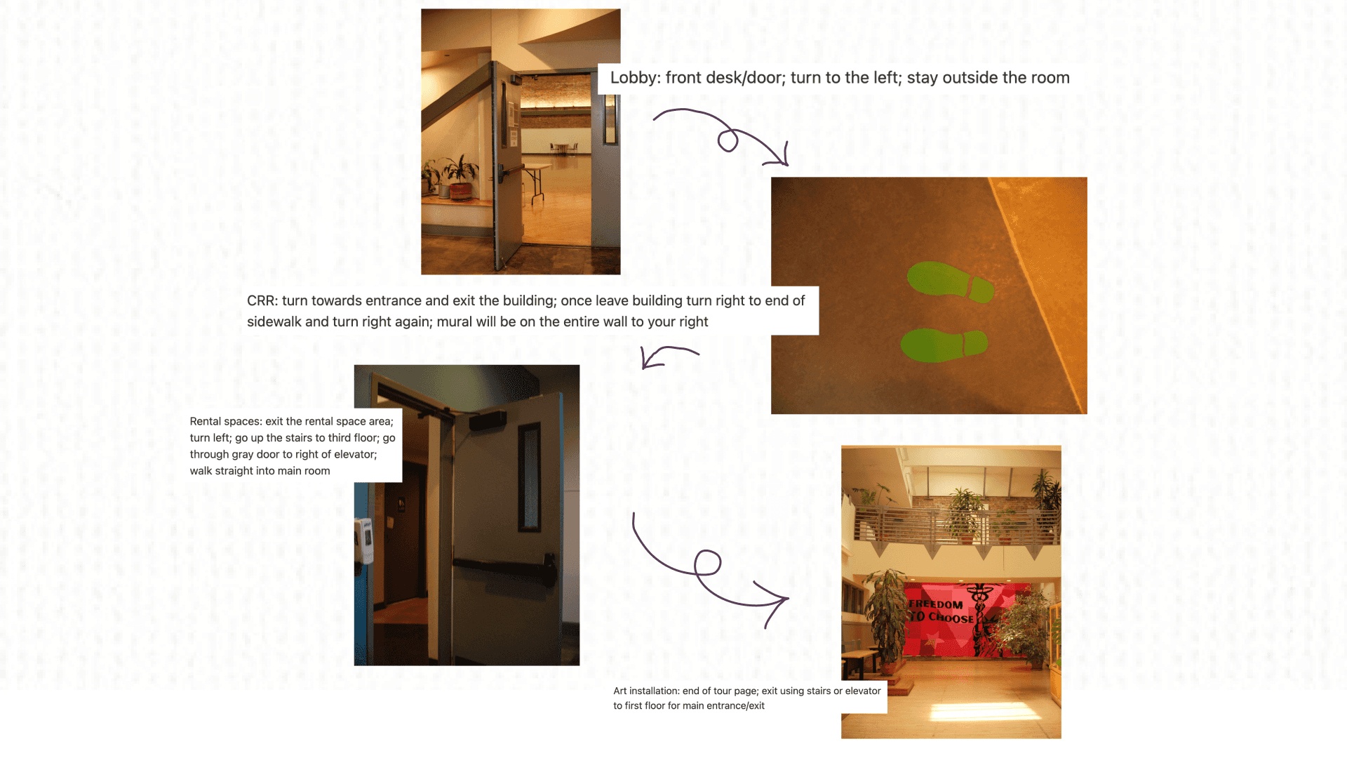
As part of our usability testing, we conducted an in-person walkthrough of the self-guided tour at The Women’s Building. By navigating the space as if we were real users, we were able to evaluate the clarity, pacing, and flow of our content in a real-world context.
We also used this opportunity to document important directional cues such as signage, stair placements, and floor transitions that would be essential for helping users navigate the building’s multi-floor layout.
Introducing: TWB's Self-Guided Tour
The Lobby
This high-fidelity lobby screen introduces users to the tour with a clear narrative structure—“Our Story,” “Our Mission,” and “Our Work”. To improve navigation and prevent scroll fatigue, purple quote boxes are used as section breakers. These elements not only separate content visually but also introduce horizontal variation that balances the vertical layout.
Clear and Engaging
Visually and Cognitively Grounding
Creative yet Information-Driven
Community Resources
This high-fidelity screen showcases the Community Resources section as an inviting, discovery-driven space where users can explore support networks tied to The Women’s Building. The design uses a playful, infographic-inspired layout with varied text and image boxes to break visual monotony. The inclusion of a fun fact adds a moment of surprise and makes the section feel less transactional and more personal.
High Visual Contrast
Dynamic Layout
Maestra Piece
Given the mural’s rich detail and multiple focal points, the page breaks down the artwork into digestible summaries so users can appreciate key features without feeling overwhelmed. A timeline of the mural’s creation is also included, offering users a sense of historical context and process. Together, these design choices prioritize clarity, honor the mural’s depth, and make the experience both informative and visually inviting.
Bite-sized Visual Highlights
Creation process at a glance
Rental Spaces
A consistent arch motif and generous negative space between modules help establish a smooth visual flow. To break up the density of information, fun fact modules are included to engage curiosity. Navigation instructions are clearly integrated with curved pathways and labeled images, making it easier for users to orient themselves across multiple floors.
Intuitive Visual Flow
Accommodates Cross-Floor Wayfinding
Engages Users Personally
Art Installations
The Art Installations section takes a different approach from the rest of the tour, using a scrapbook-inspired, collage-style layout to reflect the creativity and artsy character of the space. Mixed textures and cutouts create a visually distinct experience that feels personal and handmade, inviting users to engage with the page more playfully. Historical context—often not visible on-site— helps users connect the artwork to its deeper meaning.
Distinct Aesthetic for a New Space
Historical Context Made Accessible
Reflections & Takeaways
Designing a self-guided tour for The Women’s Building pushed us to find creative solutions within tight constraints, balancing client requests, spatial realities, and user needs. Through iterative design, in-person testing, and collaborative feedback, we developed a cohesive, engaging experience that honors the building’s history, function, and vibrant community.
Designing for Clarity and Accessibility
Across screens, we prioritized clear navigation, concise language, and visual pacing to accommodate users of all backgrounds and technical experience whether they’re walking, scrolling, or both. From presenting mural history to rental details to community resources, we made information feel personal and approachable
Space-Responsive Storytelling
Each screen reflects the character of its content: the artsy collage layout for installations, the clean visual flow for rentals, the scrapbook feel for murals, and the infographic style for resources. By designing with the space in mind, we let the building's personality lead the visual language.
Adapting to Non-Interactive Constraints
Client preferences for non-interactive, single-scroll pages challenged us to rethink how to structure content without overwhelming users. We used visual hierarchy, color, and modular design to create rhythm and clarity.

The Women's Building San Francisco


